The first 10 seconds a client or employee spends in your space are the most critical. Before a single word is spoken, your environment has already communicated a message about your brand’s values, your professionalism, and your attention to detail.
While structural layout and furniture play their part, colour is the most immediate and emotive tool at your disposal.
A commercial repaint is more than a decorating job. Whether you are launching a new flagship premises or undertaking a strategic rebrand, your choice of palette is a business decision. It influences staff productivity and reinforces brand authority.
In this guide, we explore paint colour ideas for commercial sectors, looking at how to move beyond aesthetics to select a colour strategy that aligns with your audience and your long-term commercial goals.
Understanding commercial colour psychology
Colour psychology is often discussed in abstract terms, but in a commercial context, it is grounded in measurable outcomes. The way a brain processes light and colour triggers physiological responses from varying heart rates and shifting cortisol levels to altering focus.
For a business, choosing the right hue is about managing these responses to support your operational objectives:
- Blue is the global standard for professional services. It conveys stability and logic, making it a staple for financial institutions and legal firms.
- Colours like red and orange stimulate appetite and urgency. They are effective in fast-paced retail or food environments but can be counter-productive in spaces requiring deep focus.
- Greens and earth tones leverage the innate human attraction to nature. These colours can help reduce employee burnout.
At Davison Solutions, we can translate these psychological principles into a practical finish that stands up to the rigours of a busy commercial environment.
Sector-specific colour guidance
Every industry has a different functional requirement for its walls. Here is how we approach paint colour ideas for commercial sectors.
Corporate offices
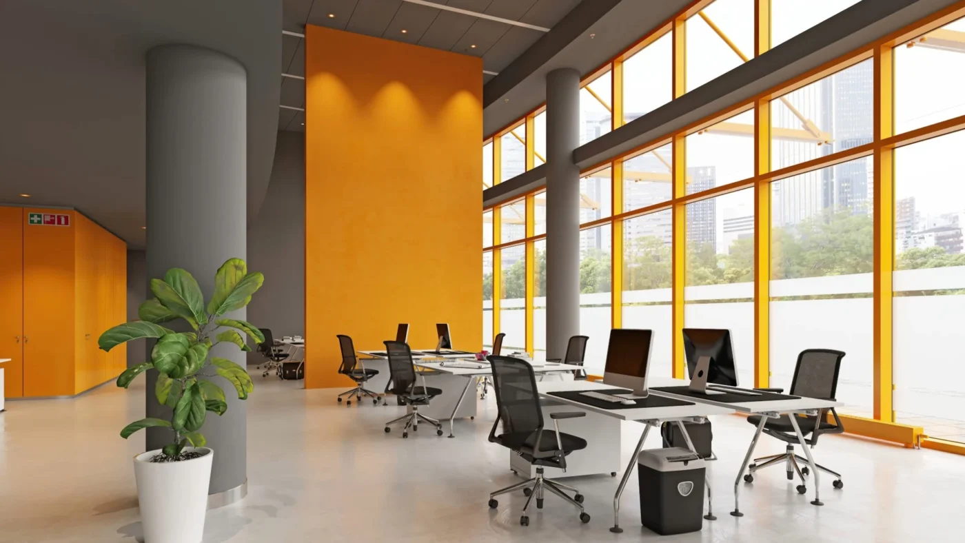
The modern office has moved away from clinical white, which was common in the 1990s. With the rise of hybrid working models, the goal is to create an office which is a destination and a space that employees want to commute to and spend time in.
At Davison Solutions, we have seen first-hand the benefit of a zoned approach with office colour schemes. Using neutral greys or off-whites for open-plan areas can maximise light and reduce eye strain. Introducing bold, brand-aligned accent walls in breakout areas or meeting rooms can stimulate creativity and reinforce company culture.
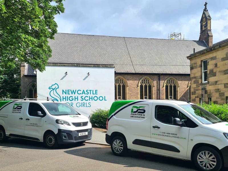
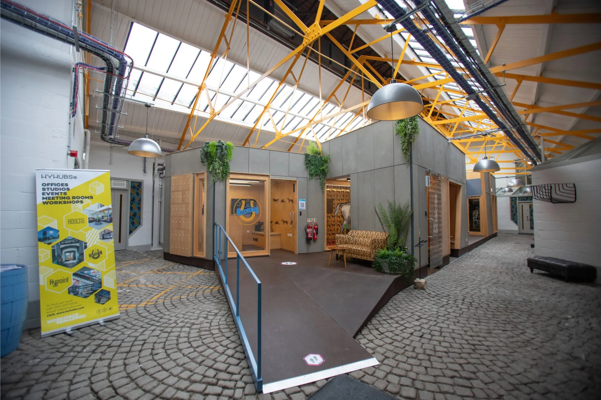
These principles were executed in our painting and decorating projects for Generator Studios and Haylofts, where zoned areas and accent colours were utilised effectively.
Healthcare environments
In healthcare, colour is a tool for patient outcomes. The environment must feel sterile for safety, yet warm for comfort.
Moving away from stark, intimidating whites is key. Soft sage greens and pale blues have been shown to lower blood pressure and anxiety. In corridors, high-contrast colour-coding can assist in wayfinding for elderly patients or those with cognitive impairments.
Retail spaces
Retail is where colour psychology meets sales strategy. The palette must frame the product, not compete with it.
With brand recognition and customer visit duration being important considerations, luxury retailers often opt for a monochrome or dark, moody palette, incorporating charcoals and navies to make products feel exclusive and high-end. Conversely, discount or high-volume retailers use bright, high-contrast colours to create a sense of energy and speed.
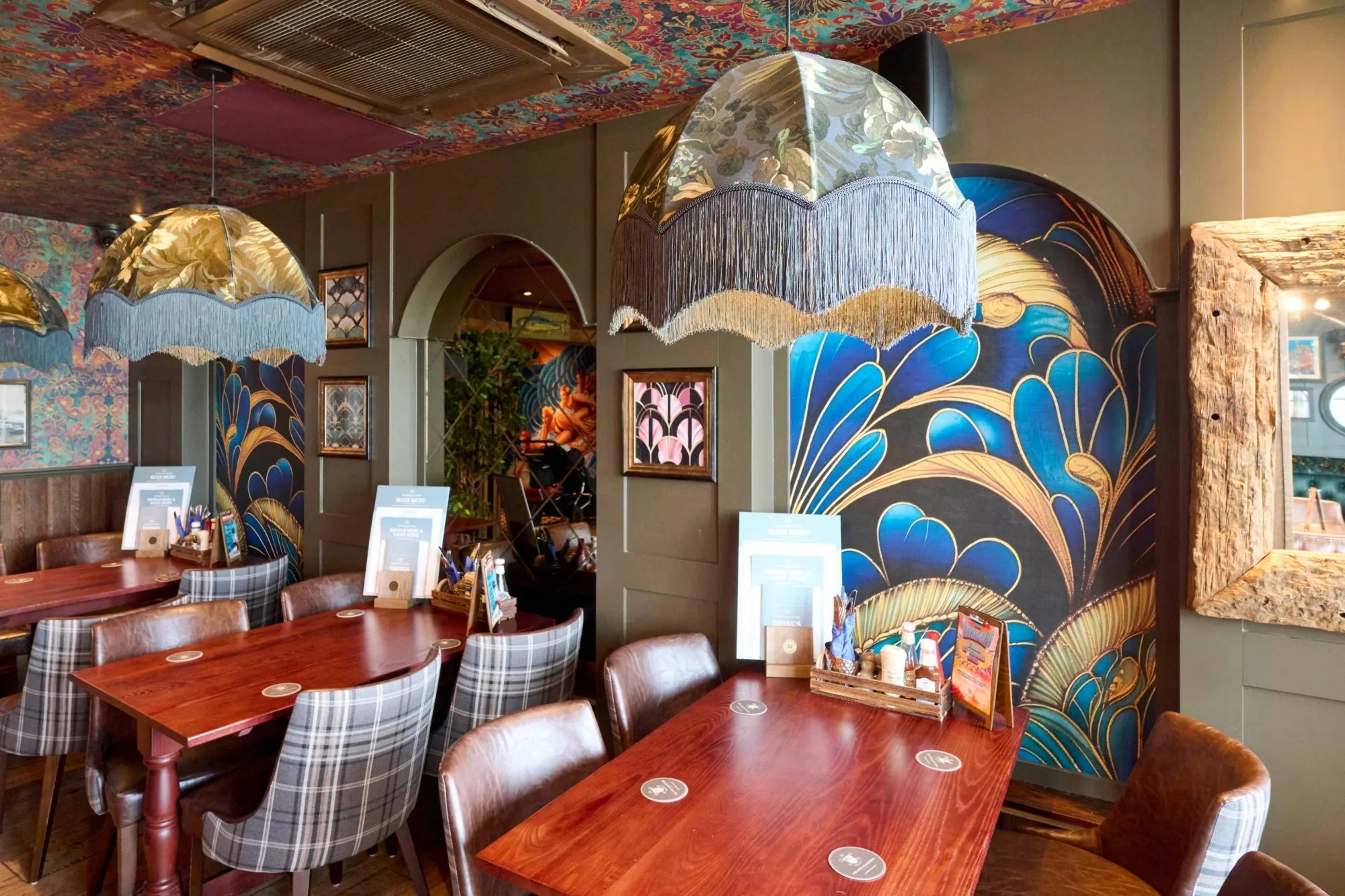
Hospitality venues
In bars, restaurants, and hotels, the paint finish majorly contributes to the overall vibe of the space. With objectives being social engagement, comfort, and lighting enhancement, opting for deep, saturated tones like forest green or burgundy can work well over artificial light and create an intimate atmosphere. Another increasingly popular trend is a feature wall with unique textures, bold colours or a unique printed wallpaper. A feature wall is a great backdrop to encourage guests to share photos of the space online.
Our work at the Tynemouth Castle Inn demonstrates how bold, vintage-inspired wallpapering can create a characterful and ‘instagrammable’ environment for guests.
Education settings
From nurseries to universities, the age of the student dictates the palette. For younger children, the goal is engagement, for older students the objective is focus.
Primary schools benefit from vibrant yellows and oranges in play areas to stimulate development. However, for secondary and higher education, we recommend more muted tones to encourage concentration and prevent over-stimulation.
Industrial and warehouse facilities
In industrial settings, paint is often a matter of health and safety rather than branding, with visibility, zoning, and light reflectance being the priority.
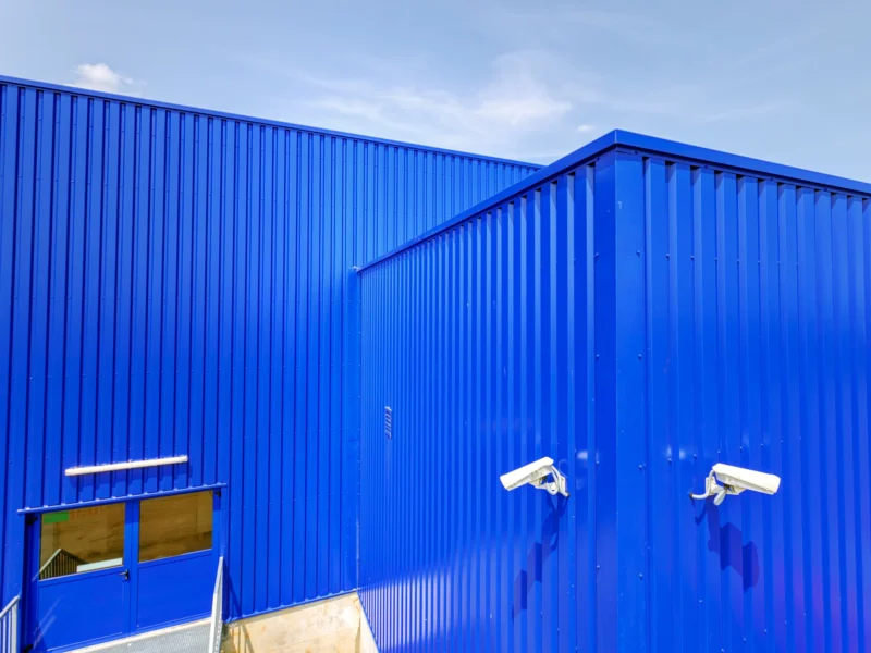
Using light-coloured, high-performance protective coatings on walls can significantly reduce lighting costs by reflecting more natural and artificial light. Colour is also used to demarcate hazard zones, walkways, and storage areas, ensuring a safe operational flow.
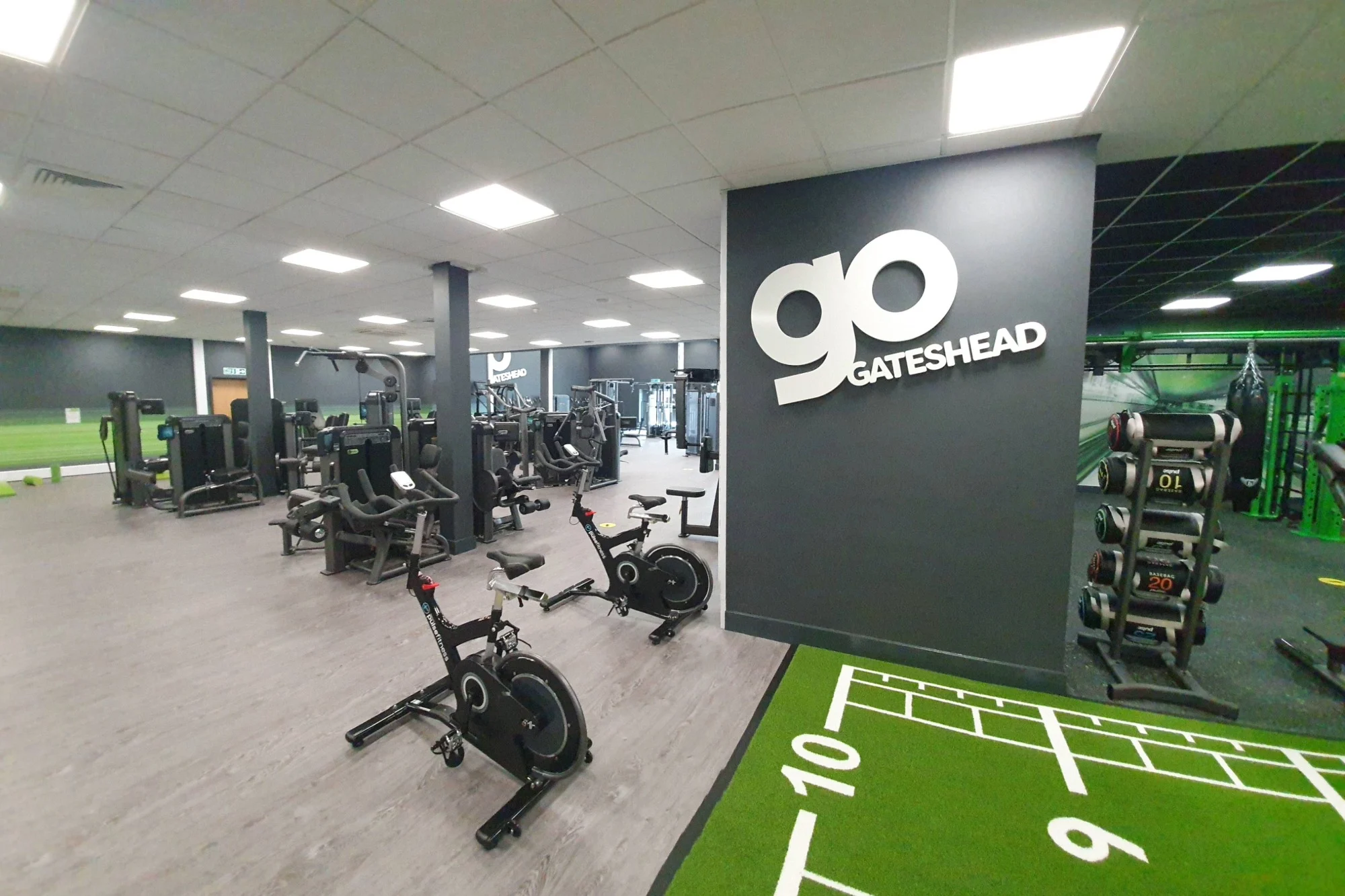
Gyms and leisure facilities
Gyms are high-energy spaces where the décor needs to be motivating and match the intensity of the activity.
Many modern boutique gyms are moving toward blackout styles with neon accents or high-energy reds. However, yoga or Pilates studios require the opposite (warm neutrals and soft textures) to support a meditative and focused state of mind.
We incorporated these accent brand colours into our recent Go Gateshead gym project, pictured below.
Choosing the right paint finish
When considering paint colour ideas for commercial sectors, the finish of the paint determines how that colour looks after six months of heavy foot traffic, trolley scrapes, and daily cleaning.
When we advise our clients, we look at three technical pillars:
Durability
Standard residential matt paint will burnish if you try to scrub off a scuff mark. In high-traffic corridors or retail environments, we specify durable acrylic matt or eggshell finishes. These allows facilities managers to maintain a fresh look without the need for constant touch-ups.
Light Reflectance Value (LRV)
LRV is a measure of how much light a colour reflects. In large commercial spaces or underground car parks, choosing a colour with a higher LRV can reduce the number of light fixtures needed, directly impacting your energy bills and carbon footprint.
Protective coatings
Your choice of commercial paint colour is not just about aesthetics; it is also about safety and preservation. Depending on your facility’s operational demands, your surfaces may require specialist systems engineered to protect against fire, corrosion, and heavy industrial wear. Our core specialist offerings include:
- Passive fire protection (intumescent coatings): We apply high-performance intumescent coatings to steel, timber, and masonry. These systems provide up to 120 minutes of fire resistance, ensuring legal compliance and critical structural safety for commercial blocks and industrial hubs.
- Specialist roof & cladding systems: From treating cut edge corrosion on metal sheet roofing to applying weather-resistant finishes to composite cladding, we extend the lifespan of your building and prevent costly structural failure.
- Two-part epoxy flooring: For environments requiring high hygiene or chemical resistance (such as food prep, healthcare, or logistics) our epoxy systems provide a non-slip and impact-resistant finish.
- Corrosion control & asset preservation: We specify industrial-grade coatings designed to stop rust in its tracks, protecting your plant machinery and metal assets from the harshest environmental conditions.
Preparation as the foundation of performance
A coating is only as good as the surface beneath it. To ensure maximum adhesion and a premium, long-lasting performance, we can deliver industrial floor blasting using high-powered abrasive equipment to create the perfect surface for new epoxy or sealants. We can also complete jet washing to deep clean cladding and masonry, removing organic growth and pollutants before treatment.
Property managers often overlook cut edge corrosion until a roof requires an expensive replacement. By treating exposed edges with flexible, watertight seals early, you can often double the life of your cladding for a fraction of the cost of a new roof.
Why partner with Davison Solutions?
At Davison Solutions, we believe a professional finish is a critical component of your asset management strategy. A well-executed rebrand or refurbishment is a significant investment, and our role is to ensure that investment yields a tangible return through enhanced brand perception, regulatory compliance, and reduced long-term maintenance costs.
Aligning environment with purpose
Colour and finish are powerful tools, but they must be fit for purpose. Whether we are working in a high-pressure healthcare environment, a high-traffic education hub, or a luxury retail space, our consultative approach ensures your palette aligns with three core pillars:
- Ensuring nationwide consistency and visual impact that resonates with your values.
- Using psychological and functional colour theory to influence how people feel and behave within your space.
- Specifying the right paint finish and technical coatings (from anti-microbial finishes to fire-rated protection) that match the operational rigours of your sector.
Working with us
As a family-owned business with a national reach, we bridge the gap between personal service and industrial scale. Founded on the values of craftsmanship and trust, our team brings award-winning expertise, recognised by the Painting & Decorating Association, to every project.
By engaging with our painting and decorating services during the early planning stages, you benefit from our turnkey approach. From initial site surveys and technical specifications to final handover, we manage the complexities of end-to-end delivery, so you don’t have to. Our ability to operate with out-of-hours and weekend shifts means your transformation happens with zero disruption to your daily operations.
Let’s plan your next milestone
Whether you are preparing for a single-site refresh or a complex nationwide rollout, the best results start with a conversation.
If you have an upcoming project or are in the early stages of a brand overhaul, we invite you to discuss your vision with us. Our team is ready to provide the technical guidance and high-specification paint finishes your property deserves.
Contact us today to arrange a consultation or site survey.